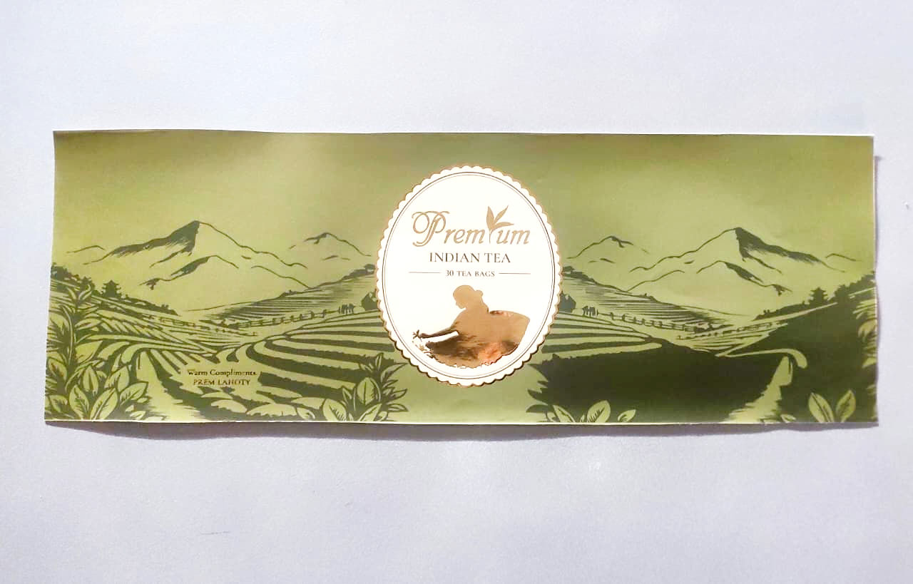
Premium Indian Tea
Industry: Interior & Styling |
Work: Logo Design, Brand Identity, and Business Collaterals
10by10 is an interior and styling studio that redefines spatial aesthetics through balance, proportion, and personality. The brand draws inspiration from timeless design principles, offering curated spaces that are both functional and emotionally resonant. Studio Kanso was commissioned to craft a brand identity that reflects this refined sensibility. The resulting logo combines sophistication with simplicity — a seamless interplay of serif typography and fluid script that mirrors 10by10’s philosophy of structured creativity. The elegant composition evokes precision, style, and a human touch — much like the interiors the brand creates. The identity was extended to business collaterals, including visiting cards that embody understated luxury through minimal design, premium textures, and a poised color palette. Every element was designed to convey confidence, taste, and timelessness — the hallmarks of the 10by10 brand. Through this collaboration, Studio Kanso helped translate 10by10’s design ethos into a cohesive visual identity that speaks of elegance, craftsmanship, and individuality.


The challenge was
To translate a century old legacy into a modern visual language, one that balanced heritage with clarity, and trust ith quite sophistication.